Golf Channel · 2016 · Commerce · Design systems
Web, iOS, Android and Watch
GolfNow
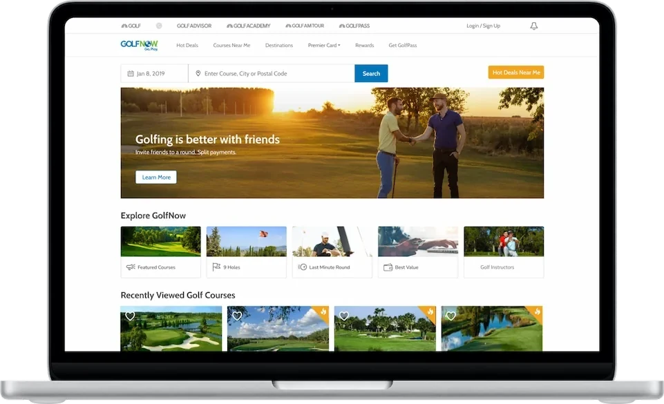
A mobile-first redesign of GolfNow across the website, the iOS and Android apps, and Apple Watch.
- My role
- UX Design, Design Direction, Design System
- Team
- Sole UX designer across web, iOS, Android, and Watch
- When
- 2016 · 1 Year
- Platforms
- Web, iOS, Android, Apple Watch
- overall revenue
- +8%
- new golfers
- +17%
- conversion
- +2.6%
- checkout drop-off
- −8%
The 30-second version
- Problem
- Web and mobile felt like different products. The site was slow, Hot Deals were buried and people were quitting checkout.
- What I did
- Built a shared design system and redesigned web, iOS, Android and Apple Watch, starting with the phone.
- Result
- The redesign contributed to an 8% lift in revenue and 17% more new golfers.
Context and constraints
GolfNow was growing, but web and mobile felt like different products. The site was slow and the UI didn't match from one place to the next. The native apps didn't connect to the rest of it either, and all of that was costing us conversions. We needed one mobile-first product that could bring in more revenue and more golfers, and keep up with competitors who'd already gone mobile.
My role and the team
I was the only UX designer, so the whole redesign was mine: responsive web, iOS, Android, and Apple Watch. I built the design system and made the call to go mobile-first. I also worked closely with engineering on speed, and on cutting the steps between a search and a booked tee time.
The problem
GolfNow was growing, but the product was a patchwork. The website wasn't responsive and it was slow, and there was no design system behind it. The iOS and Android apps had been built by an outside agency and didn't feel like the same product.
Hot Deals, the tee times GolfNow makes the most money on, were hard to find, and people were dropping out of checkout. Competitors were going mobile-first while we weren't.
Key decisions
01 / 03
Start with the system
- The call
- Build one set of components and interaction patterns across the four platforms.
- Why
- The outsourced apps and the website had drifted apart. We brought the apps back in-house so they would match.
02 / 03
Put booking on the phone first
- The call
- Design for the phone first, surface Hot Deals and cut steps out of checkout.
- Why
- Most golfers book on their phone. Behavioral analytics and user research pointed to buried Hot Deals and checkout drop-off.
03 / 03
Cut on-course ordering
- The call
- Leave on-course food and beverage ordering out to ship.
- Why
- It was part of the scope I cut for this release.
- Tradeoff
- On-course food and beverage ordering did not ship with the redesign.
The work
How it scaled
Web, iOS, Android and Apple Watch use the same components and interaction patterns. A lot of screens changed after launch, but the design system stayed.
Results
The redesign contributed to an 8% lift in revenue and 17% more new golfers, and it put web and mobile on one design system for the first time.
- overall revenue
- +8%
- new golfers
- +17%
- conversion
- +2.6%
- checkout drop-off
- −8%
Reflection
This is the project where I learned to start with the system. A lot of the screens changed after launch, but the design system under them stuck around, and it's what I pointed to whenever I had to make the case for design.