Meta · 2024 · Privacy · Consent
In Meta's Consent UI Guidelines
GDPR Consent Flow
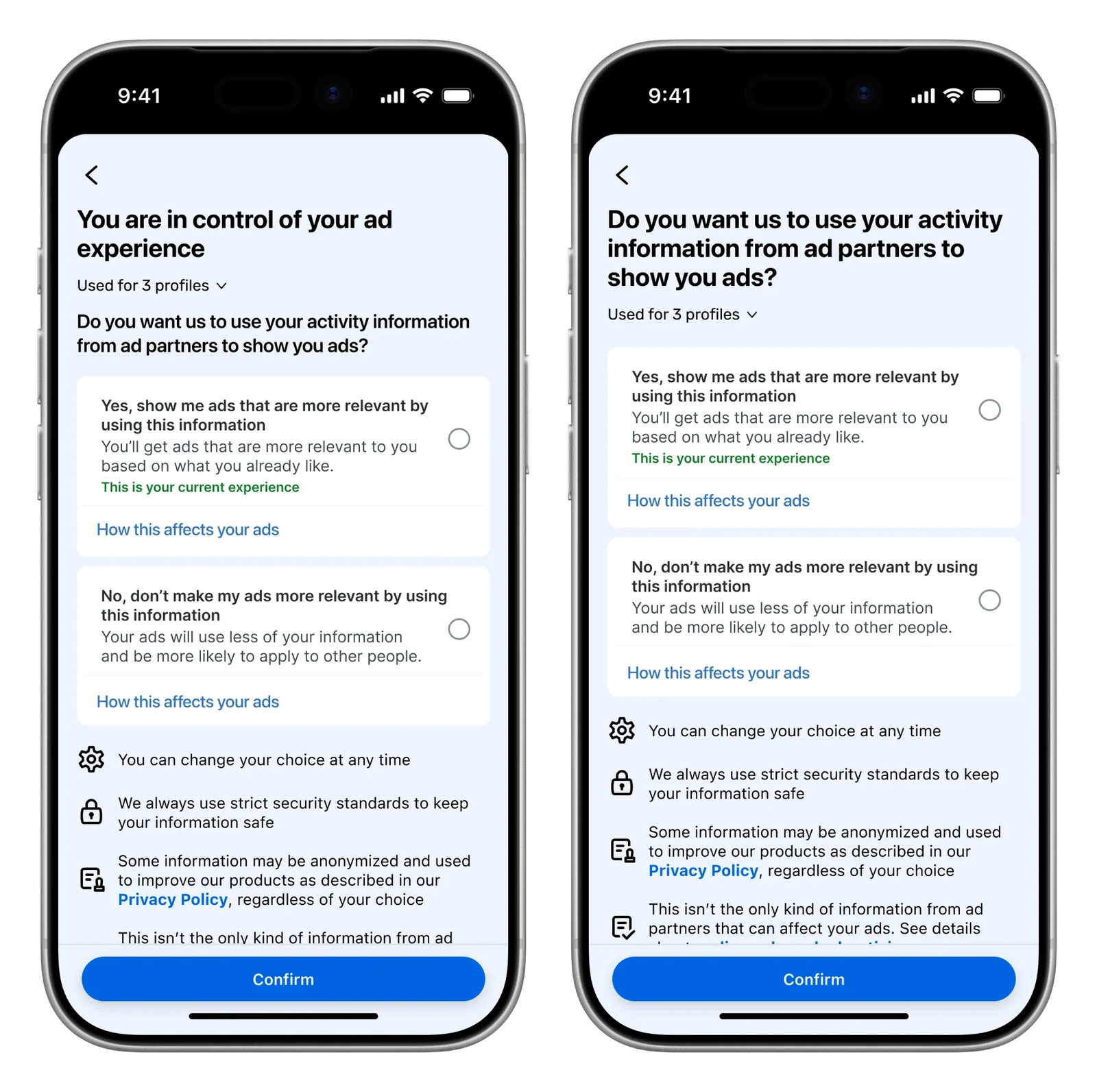
Meta's consent prompt for ad partner data in the EU, UK and Switzerland. I redesigned it so saying no takes the same effort as saying yes.
- My role
- Design lead
- Team
- PM, engineering, Legal, Policy, content design and UX research
- When
- 2024 · 9 months
- Platforms
- iOS, Android, Web
- backtracking in the flow
- −30%
- misreading the key terms
- −34%
- incremental revenue protected, estimated
- 1.97%
The 30-second version
- Problem
- Agree was the big blue button. No meant changing an answer already set to yes, on another screen.
- What I did
- Gave both answers the same weight and room to explain what sharing the data means.
- Result
- Backtracking dropped 30% and people misread the terms 34% less. We estimated it protected 1.97% in incremental revenue.
Context and constraints
In 2024 I led design on Meta's consent flow for third-party data. That's the prompt asking people in the EU, UK, and Switzerland whether Meta can use activity information from ad partners to show them ads. It ran on Facebook, Instagram, WhatsApp, and Messenger, so it reached hundreds of millions of people. Legal was watching it closely, and a lot of ad revenue depended on what people chose.
My role and the team
I was the designer on a team with a PM, engineers, Legal, Policy, a content designer and UX research. The design patterns for consent were my call.
The problem
The old flow leaned toward yes. Agreeing to share your data was the big blue primary button. Saying no meant tapping into Manage settings, reading another screen, and changing an answer that was already set to yes. Under GDPR, consent has to be freely given, and extra steps on only one side are a nudge. That's what we had.
The words were a problem too. Activity Information and Ad Partners made sense to us internally, but research showed a lot of people in other regions didn't know what they meant. So they were being asked to agree to something they didn't understand.
Key decisions
01 / 03
Same weight for both answers
- Options
- Keep Agree as the primary button, or give both answers equal weight.
- The call
- Use matching radio selections, with a plain explanation under each answer.
- Why
- Saying no took extra steps in the old flow. Both answers needed the same weight.
- Tradeoff
- Equal buttons would have been a one-off. The design system paired a primary button with a secondary one, and this project didn't justify an exception.
02 / 03
What goes in the headline
- Options
- Lead with the polar question or an agency statement.
- The call
- I proposed “You are in control of your ad experience,” with the question lower down.
- Why
- The question led with Activity Information and Ad Partners, the terms people did not understand. Lower down, there was room to explain them.
- Tradeoff
- Consent SteerCo split the messaging by region. Some markets kept the question.
03 / 03
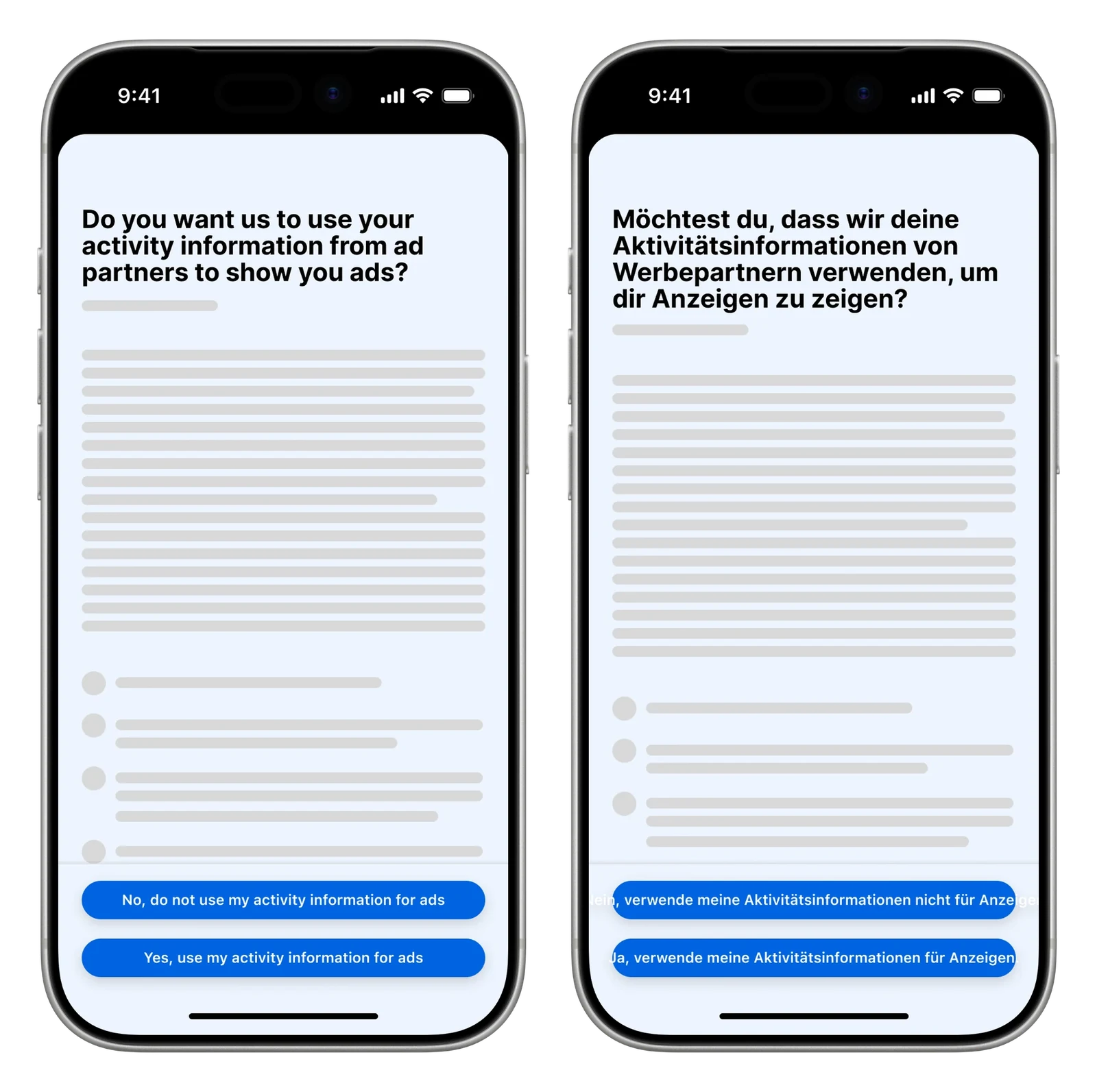
German didn't fit
- The call
- Shorten the button labels and move the longer opt-in and opt-out text into the radio selections.
- Why
- The German strings broke Version 1's layout.
The work
How it scaled
The headline and button model went into Meta's Consent UI Guidelines.
Results
It shipped on Facebook and Instagram, and the fairer version didn't cost the business anything. We estimated it protected 1.97% in incremental revenue. Backtracking in the flow dropped 30%, and people misread the key terms 34% less.
The pattern went into the Consent UI Guidelines, so the next team that has to ask for consent starts from it.
- backtracking in the flow
- −30%
- misreading the key terms
- −34%
- incremental revenue protected, estimated
- 1.97%
Reflection
We ended up splitting the consent messaging by region. I would have pushed to use the agency statement globally, because it leads with a sense of empowerment over how your data is used. I think Meta needed that stance in the world.